
Home
Bio-Ag Consultants & Distributors Inc. | Summer 2025
Helping dog owners find real food, and real stores, faster.
A e-commerce site for Norman's Naturals, a Canadian dog food brand acquired by Bio-Ag Consultants & Distributors Inc. Designed and built by myself over the span of one month, with a focus on the two things that actually drive revenue: retail store discovery and a shop experience that doesn't overwhelm first-time buyers.

Context & Constraints
A real brand, a real deadline, no runway for a traditional process.
Norman's Naturals had just been acquired by Bio-Ag, a 40-year-old animal nutrition company, and needed a proper e-commerce presence fast. I was the only designer on the project, working inside a live business which meant the "research phase" of my process looked different than a typical case study.
My constraints
1.
No time budgeted for formal wireframing before build, I designed largely in-browser using Shopify's theme editor, working from rough sketches rather than polished mockups.
2.
No user research budget or access to real customers. I relied on structured feedback sessions with 5 colleagues at Bio-Ag who represented different vantage points on the buyer (sales, customer service, warehouse).
The business problem
Bio-Ag's actual revenue mostly came from retail partners independent pet stores, feed stores, and co-ops across Ontario who stocked Norman's Naturals on their shelves. Direct-to-consumer online orders were a smaller, newer channel.
But the existing web presence didn't reflect that. There was no clear way for a customer to find out where to actually buy the food locally, so people either defaulted to guessing at a big-box store or gave up. That's a problem for a business whose bread and butter is retail distribution, every visitor who leaves without finding a nearby stockist is a missed sale and a missed data point for retail partners.
3.
Existing brand guidelines were locked, logo, color palette, and product photography style were provided and non-negotiable.
4.
Built on Shopify, which meant working within theme/app constraints rather than a fully custom stack.
Personas
Two very different reasons to land on this site.
Working from conversations with the Bio-Ag sales and customer service team who talk to real buyers every day. I identified two distinct customer mindsets the site needed to serve without one crowding out the other.
Site Map
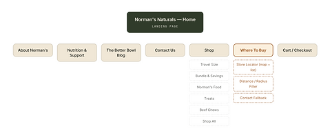
Where To Buy not buried in a footer.
The biggest IA decision was structural: "Where To Buy" and "Shop" needed equal visual weight in primary navigation, rather than treating the site as a pure online store with retail info as an afterthought.


Click any image for full view *
Wireframes
Reconstructed from my original in-browser sketches.
Because the timeline didn't allow for a formal wireframing phase, these are cleaned-up, faithful reconstructions of the rough structural sketches I actually used to plan layout and hierarchy before building in Shopify's theme editor, shown here in standard lo-fi fidelity for portfolio clarity.
Landing page
Hero establishes trust and product quality fast, then routes into two paths: shop online, or find a nearby retailer reflecting the dual customer base.
Shop
Category-first structure lets Marcus self-select by need (trial size vs. full bag vs. treats) instead of browsing one long undifferentiated product grid.
Where to buy
The centerpiece of this case study. An interactive store locator with a distance filter and result count control, designed to get Dana from "does anyone near me carry this" to a specific address in under 30 seconds.


Research
Guerrilla testing, not a formal usability study.
I didn't have the timeline or participant access to run a moderated usability study with real customers. What I ran instead was structured hallway/guerrilla testing with 5 Bio-Ag colleagues, chosen specifically because they weren't involved in building the site and had varying familiarity with the product, a reasonable stand-in when the alternative was shipping with zero validation.
Method
Guerrilla / Hallway Testing
Participants
5 Bio-Ag employees
Format
Think-aloud, task-based
Focus
Store locator + Shop flow
Informal, task-based sessions with available colleagues rather than recruited external participants chosen for speed and zero cost, with the known tradeoff of internal bias.
Each person completed 3 tasks on a working staging build while narrating their thinking out loud. Sessions ran ~15 minutes each, in person, one on one.
Mixed roles: 2 customer service reps, 1 warehouse worker, 1 sales person, 1 accountant. Deliberately not the marketing or design team, to reduce built-in bias toward my own decisions.
Given the business priority, most task time was spent on the Where To Buy tool and the path from homepage into Shop.
Note: A 5-person internal colleague test is not a substitute for moderated research with real customers, and I don't want to present it as more rigorous than it was. What it gave me was fast, directional signal on obvious usability blockers before launch, which is what the timeline allowed for. On a future project with more runway, I'd push for unmoderated remote testing with actual dog owners recruited outside the company.
Next

